[시각화]치솟는 부동산과 하락하는 출산율(인구편)
현재 우리나라는 200여개의 국가 중 출산율이 최하위권일 정도로 저출산 문제가 심각합니다. 저출산에는 다양한 문제가 복합적으로 얽혀 있지만 경제적인 측면에서 알아보고자 합니다.
30대를 지내면서 친구들과의 대화는 주로 주식, 부동산과 같은 경제적인 부분과 직장, 그리고 결혼에 대한 주제가 주를 이루고 있습니다. 최근에는 결혼을 고민하는 친구들이 많이 생기고 있습니다. 하지만 결혼에는 돈, 집, 자식 등 많은 걱정이 뒤따르기 때문에 모두 부담을 느끼고 있습니다. 특히, 가장 큰 걱정은 ‘집 값’ 이었습니다.
이러한 부동산 가격의 상승이 결혼에 미치는 영향과 그로인해 출산율이 낮아지는 것이 연관되어 있는지 시각화를 통해 살펴보도록 해봅시다.
1. 인구
총 인구 수, 출생아 수, 사망자 수 등을 포함한 데이터를 확인해봅니다.
1.1. 데이터 확보
- 총 인구, 인구동향, 가구원 등의 원하는 데이터를 확보합니다.
- 통계청 홈페이지에서 관련 데이터를 원하는 형태로 받을 수 있습니다.
- 가구원 수의 데이터는 통계청의 자료를 잘 정리한 국가지표체계에서 받았습니다.
- 데이터 별로 제공하는 모든 시점을 가져와서 확인해봅니다.
1.2. 데이터 확인
- Pandas를 사용해 데이터를 불러옵니다.
- skiprows와 skipfooter 를 사용해 필요없는 부분을 잘라줍니다.
- thousands 는 천 단위 마다 찍혀있는 콤마(,) 를 미리 없애줍니다.
- 데이터를 미리 확인한 결과 결측값은 (-) 로 표현돼 있는 것을 확인했습니다.
1 2 3 4 5 | import pandas as pd df1 = pd.read_csv('인구동향.csv', encoding='CP949') df2 = pd.read_csv('총인구.csv', encoding='CP949', skiprows=1) df3 = pd.read_excel('가구원 수.xls', skiprows=3, skipfooter=5, thousands=',') |
- 데이터를 확인해봅니다.
1 | df1.head() |
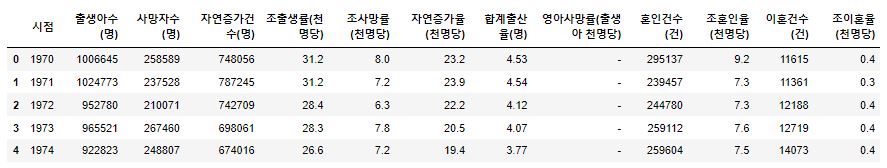
- 시작 시점 부분 영아사망률에 결측값 (-) 이 들어가 있습니다. 특정 시점부터 통계를 집계한것으로 보입니다.
1 | df2.head() |
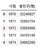
- 인구동향과 같은 기간이므로 데이터를 하나로 통합해줍니다.
1 2 3 | population_census = df1 population_census['총인구(명)'] = df2['총인구(명)'] population_census.head() |
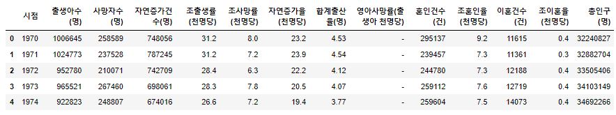
- 데이터에서 수정할 부분을 찾았습니다.
1 | population_census.tail() |
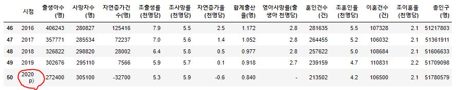
- 가장 최근인 2020년의 데이터를 확인해 본 결과 잠정치 라고 해서 p) 가 붙어있습니다.
- 이 부분을 수정해주고
시점을 datetime 으로 변환해 줍니다.
1 2 3 | population_census.loc[50,'시점'] = '2020' population_census['시점'] = pd.to_datetime(population_census['시점']) population_census.head() |
- 가구원 데이터를 살펴봅니다.
1 | df3.head() |
- 가구원 데이터는 1970년 부터 2015년도까지는 5년 주기였지만 2016년부터 1년 주기로 변경되어 시점이 들쭉날쭉하지만 추세는 알아볼 수 있을거 같습니다.
- 1인~6인 이상 가구는 전체 가구에서 비중을 나타냅니다.
- column 은 수정이 필요해 보입니다.
1 2 3 | column_name = ['시점', '가구수(천 가구)', '1인가구(%)', '2인가구(%)', '3인가구(%)', '4인가구(%)', '5인가구(%)', '6인 이상가구(%)', '평균 가구원수(명)'] df3.columns = column_name df3.head() |
- 1970년의 1인가구는 집계에 포함되지 않은 것으로 판단됩니다.
- 비중의 변화를 체크하는데 적절하지 않으므로 제거하고 실수 type으로 변경합니다.
시점을 datetime으로 변경해줍니다. (datetime 으로 변경은 object type에서 진행해줘야 합니다.)
1 2 3 4 5 | df3.drop(0, inplace=True) # 0번째 index 제거 df3 = df3.reset_index(drop=True) # index 재설정 df3['1인가구(%)'] = df3['1인가구(%)'].astype('float') # 실수 type으로 변경 df3['시점'] = pd.to_datetime(df3['시점'].astype('str')) # 시점을 datetime 으로 변경 df3.head() |
- 시각화 할 데이터 준비가 끝났습니다.
1.3. 데이터 시각화
- 시각화를 하기 위한 도구를 불러옵니다.
- 한글을 사용하기 위해 한글 폰트 설정을 추가해줍니다.
1 2 3 4 | import matplotlib.pyplot as plt plt.rcParams['font.family']='NanumGothic' # 한글 폰트 사용 plt.rcParams['axes.unicode_minus'] = False # 한글 폰트 사용시 -값 깨짐 해결 |
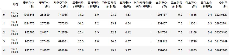
1.3.1. 출생, 사망, 총인구
출생아수(명),사망자수(명)의 그래프를 그려봅니다.
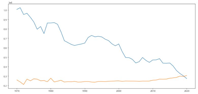
1 2 3 4 5 6 | fig, ax = plt.subplots(figsize=(15,7)) ax.plot(population_census['시점'], population_census['출생아수(명)']) ax.plot(population_census['시점'], population_census['사망자수(명)']) plt.show() |
- 그래프의 가독성을 높이기 위해 수정을 해줍니다.
- 차트의 모양과 색을 변경하고 축 제거 및 grid 를 추가해 줍니다.
- 그래프가 어떤 데이터를 나타내는지 알기위해 범례도 추가합니다.
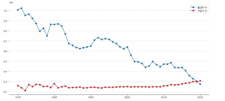
1 2 3 4 5 6 7 8 9 10 11 12 13 14 15 16 17 | fig, ax = plt.subplots(figsize=(15,7)) # 축 제거 ax.spines['left'].set_visible(False) ax.spines['right'].set_visible(False) ax.spines['top'].set_visible(False) ax.plot(population_census['시점'], population_census['출생아수(명)'], 'o-', label='출생아 수', color='tab:blue') ax.plot(population_census['시점'], population_census['사망자수(명)'], 'o-', label='사망자 수', color='tab:red') # 범례 추가 ax.legend() # y축 grid 추가 ax.grid(axis='y', linestyle=':', which='major') plt.show() |
- y축의 값들이 알아보기 어렵기 때문에 축이 표시하는 값을 변경해줍니다.
- 축에는 ticks와 ticklabels 가 있습니다.
1 2 | print('yticks : ', ax.get_yticks()) print('yticklabels : ', ax.get_yticklabels()) |

- 각 명령어는 다음과 같이 표시되는 것을 볼 수 있습니다.
- 만명 단위로 표시되게 바꿔줍니다.
- yticks의 값을 변화 시켜 yticklabels에 넣어줍니다.
- x축에 label도 설정해줍니다.
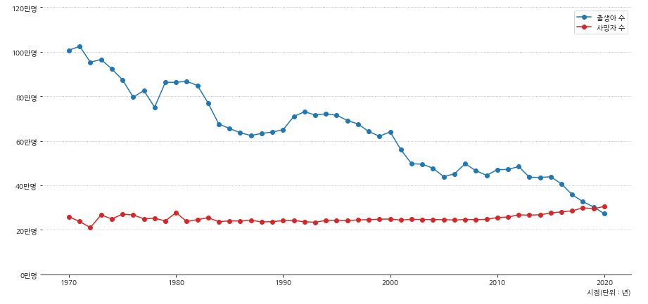
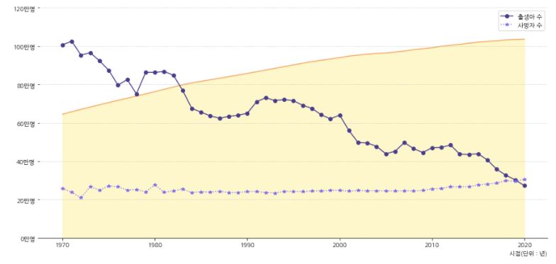
1 2 3 4 5 6 7 8 9 10 11 12 13 14 15 16 17 18 19 20 21 22 23 24 25 26 27 28 | fig, ax = plt.subplots(figsize=(15,7)) # 축 제거 ax.spines['left'].set_visible(False) ax.spines['right'].set_visible(False) ax.spines['top'].set_visible(False) ax.plot(population_census['시점'], population_census['출생아수(명)'], 'o-', label='출생아 수', color='tab:blue') ax.plot(population_census['시점'], population_census['사망자수(명)'], 'o-', label='사망자 수', color='tab:red') # y축 범위 수정 ax.set_ylim(0, 1200000) # y축 표시 변경 yticks = ax.get_yticks() ax.set_yticks(yticks) ax.set_yticklabels([f'{i//10000:.0f}만명' for i in yticks]) # x축 label 설정 ax.set_xlabel('시점(단위 : 년)',loc='right') # 범례 추가 ax.legend() # y축 grid 추가 ax.grid(axis='y', linestyle=':', which='major') plt.show() |
- 마지막으로 배경에 총인구수 그래프를 나타내 주겠습니다.
- 우선 총인구수 그래프를 확인해 봅니다.
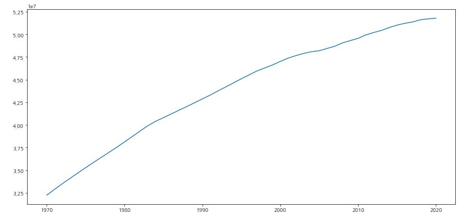
1 2 3 4 5 | fig, ax = plt.subplots(figsize=(15,7)) ax.plot(population_census['시점'], population_census['총인구(명)']) plt.show() |
- twinx() 함수를 사용하면 x축만 공유를 하는 그래프를 그릴 수 있습니다.
- zorder를 사용하면 axis의 순서를 지정할 수 있습니다. (숫자가 작을수록 우선)
- 그래프의 색과 모양은 적절하게 구별할 수 있도록 변환해 줍니다.
1 2 3 4 5 6 7 8 9 10 11 12 13 14 15 16 17 18 19 20 21 22 23 24 25 26 27 28 29 30 31 32 33 34 35 36 37 38 39 40 41 | fig, ax = plt.subplots(figsize=(15,7)) ax.set_facecolor('none') # ax의 배경색 제거 # 축 제거 ax.spines['left'].set_visible(False) ax.spines['right'].set_visible(False) ax.spines['top'].set_visible(False) # 총인구 그래프 배경으로 추가 ax_population = ax.twinx() ax_population.plot(population_census['시점'], population_census['총인구(명)'], color='sandybrown') ax_population.fill_between(population_census['시점'], population_census['총인구(명)'], color='gold', alpha=0.2) # 그래프 배경색 채우기 ax_population.set_ylim(0, 60000000) ax_population.axis(False) # 축 값 제거 # ax의 순서 지정 ax_population.set_zorder(0) ax.set_zorder(1) # 출생, 사망 그래프 ax.plot(population_census['시점'], population_census['출생아수(명)'], 'o-', label='출생아 수', color='darkslateblue') ax.plot(population_census['시점'], population_census['사망자수(명)'], '*:', label='사망자 수', color='mediumslateblue') # y축 범위 수정 ax.set_ylim(0, 1200000) # y축 표시 변경 yticks = ax.get_yticks() ax.set_yticks(yticks) ax.set_yticklabels([f'{i//10000:.0f}만명' for i in yticks]) # x축 label 설정 ax.set_xlabel('시점(단위 : 년)',loc='right') # 범례 추가 ax.legend() # y축 grid 추가 ax.grid(axis='y', linestyle=':', which='major') plt.show() |
- 총인구 그래프의 모든 축과 눈금을 제거한 대신에 시작과 끝 지점에 데이터 수치를 표시해 주도록 합니다.
- 범례의 위치도 조정해 줍니다.
1 2 3 4 5 6 7 8 9 10 11 12 13 14 15 16 17 18 19 20 21 22 23 24 25 26 27 28 29 30 31 32 33 34 35 36 37 38 39 40 41 42 43 44 45 46 47 48 49 50 51 | fig, ax = plt.subplots(figsize=(15,7)) ax.set_facecolor('none') # ax의 배경색 제거 # 축 제거 ax.spines['left'].set_visible(False) ax.spines['right'].set_visible(False) ax.spines['top'].set_visible(False) # 총인구 그래프 배경으로 추가 ax_population = ax.twinx() ax_population.plot(population_census['시점'], population_census['총인구(명)'], color='sandybrown') ax_population.fill_between(population_census['시점'], population_census['총인구(명)'], color='gold', alpha=0.2) # 그래프 배경색 채우기 ax_population.set_ylim(0, 60000000) ax_population.axis(False) # 축 값 제거 # 총인구 수치 표시 r_1970 = population_census['총인구(명)'].iloc[0] r_2020 = population_census['총인구(명)'].iloc[-1] for idx, r, ha in zip([0, ax_population.get_xticks()[-2]], [r_1970, r_2020], ['right', 'left']): ax_population.text(idx, r+800000, f'{r//10000}만 명', fontdict={'fontsize':12, 'color':'brown', 'ha':ha, 'va':'bottom'}) # 데이터 정보 표시 ax_population.text(ax_population.get_xticks()[-3], population_census['총인구(명)'].iloc[30], '대한민국 총 인구수', fontdict={'fontsize':13, 'fontweight':'bold', 'color':'brown', 'va':'bottom'}) # ax의 순서 지정 ax_population.set_zorder(0) ax.set_zorder(1) # 출생, 사망 그래프 ax.plot(population_census['시점'], population_census['출생아수(명)'], 'o-', label='출생아 수', color='darkslateblue') ax.plot(population_census['시점'], population_census['사망자수(명)'], '*:', label='사망자 수', color='mediumslateblue') # y축 범위 수정 ax.set_ylim(0, 1200000) # y축 표시 변경 yticks = ax.get_yticks() ax.set_yticks(yticks) ax.set_yticklabels([f'{i//10000:.0f}만명' for i in yticks]) # x축 label 설정 ax.set_xlabel('시점(단위 : 년)',loc='right') # 범례 추가 및 위치 설정 ax.legend(ncol=2, loc='upper center') # y축 grid 추가 ax.grid(axis='y', linestyle=':', which='major') plt.show() |
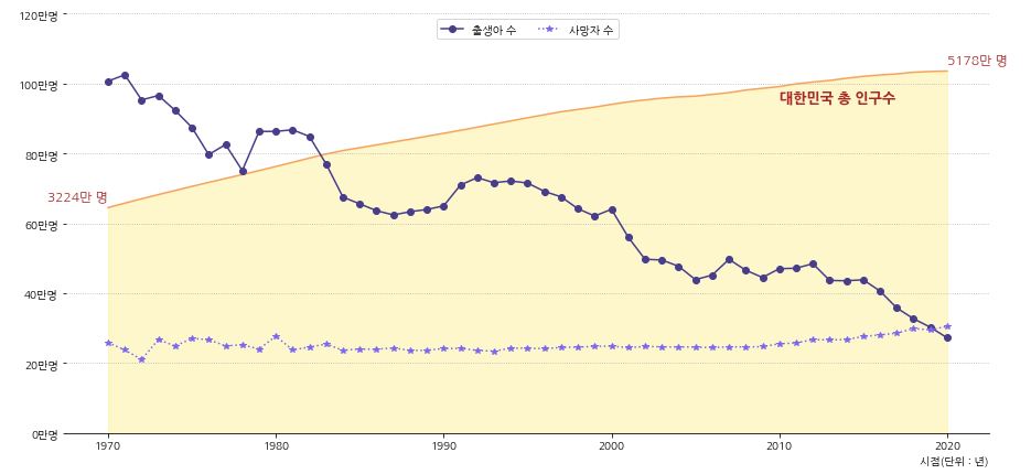
- 데이터 제공 시기인 1970년 부터 현재까지 꾸준하게 출생아 수가 줄고 있는 것을 볼 수 있습니다.
- 대한민국은 1960년대부터 산아제한 정책을 진행해왔고 1970년대부터는 각종 파격적인 혜택을 주었습니다.
- 1970년 이전의 상황은 알 수 없지만 이러한 정책으로 인해 출산율이 줄어들었다고 판단할 수 있습니다.
- 그에 비해 사망자 수는 특이한 점은 찾을 수 없었지만 2019년을 기점으로 사망자수가 출생아 수를 넘어선 것을 볼 수 있습니다.
- 그러면 혼인과 이혼 건수를 시각화해서 확인해보도록 합니다.
1.3.2. ADD 혼인, 이혼
- 혼인과 이혼을 그래프로 확인합니다.
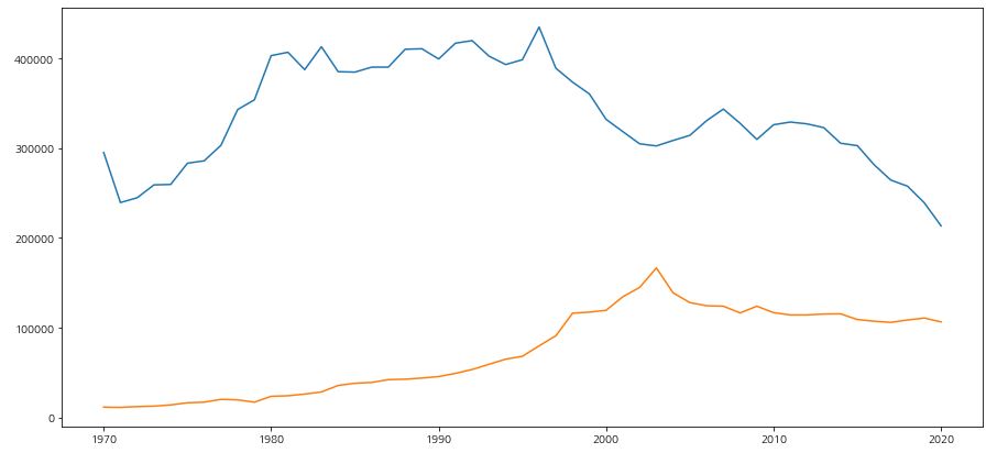
1 2 3 4 5 6 | fig, ax = plt.subplots(figsize=(15,7)) ax.plot(population_census['시점'], population_census['혼인건수(건)']) ax.plot(population_census['시점'], population_census['이혼건수(건)']) plt.show() |
시점이 같기 때문에 기존 그래프에 데이터를 추가해서 그려봅니다.- 다음과 같은 코드를 추가합니다.
1 2 3 4 5 6 7 8 9 10 11 12 13 14 15 16 17 18 19 20 21 22 | # 혼인, 이혼 그래프 추가 ax_add = ax.twinx() # x축을 공유하는 axis 생성 ax_add.plot(population_census['시점'], population_census['혼인건수(건)'],'*-' ,label='혼인 건수', color='crimson') ax_add.plot(population_census['시점'], population_census['이혼건수(건)'],'*:' ,label='이혼 건수', color='mediumvioletred') # 축 제거 ax_add.spines['left'].set_visible(False) ax_add.spines['right'].set_visible(False) ax_add.spines['top'].set_visible(False) ax_add.spines['bottom'].set_visible(False) # y축 범위 지정 ax_add.set_ylim(0, 1200000) # y축 ticklabel 값 표시 변경 ytick2 = ax_add.get_yticks() ax_add.set_yticks(ytick2) ax_add.set_yticklabels([f'{j//10000:.0f}만 건' for j in ytick2]) # 범례 표시 ax_add.legend(ncol=2, loc='upper right') |
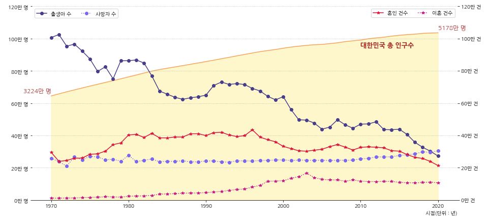
- 1970년 부터 1980년 까지 혼인 건수는 늘었지만 1990년대 후반부터 혼인 건수가 서서히 감소하기 시작합니다.
- 최근 20년 동안 혼인 건수는 절반정도로 줄었습니다.
- 이혼 건수도 상당히 많이 늘어나긴했지만 출산과 연관짓기에는 애매한 부분이 있어보입니다.
- 혼인 건수가 줄어 출생아 수가 줄어들고 있는 것도 어느정도는 연관이 있어보입니다.
- 하지만 혼인 건수가 적건 많건 출생아 수는 꾸준히 줄고 있기때문에 다음으로 합계출산율을 알아보겠습니다.
- 위의 코드 전문입니다.
1 2 3 4 5 6 7 8 9 10 11 12 13 14 15 16 17 18 19 20 21 22 23 24 25 26 27 28 29 30 31 32 33 34 35 36 37 38 39 40 41 42 43 44 45 46 47 48 49 50 51 52 53 54 55 56 57 58 59 60 | fig, ax = plt.subplots(figsize=(15,7)) ax.set_facecolor('none') # ax의 배경색 제거 # 출생, 사망 그래프 ax.plot(population_census['시점'], population_census['출생아수(명)'], 'o-', label='출생아 수', color='darkslateblue') ax.plot(population_census['시점'], population_census['사망자수(명)'], 'o:', label='사망자 수', color='mediumslateblue') ax.set_ylim(0, 1200000) # y축 범위 수정 ax.set_xlabel('시점(단위 : 년)',loc='right') # x축 label 설정 ax.grid(axis='y', linestyle=':', which='major') # y축 grid 추가 # 총인구 그래프 배경으로 추가 ax_population = ax.twinx() ax_population.plot(population_census['시점'], population_census['총인구(명)'], color='sandybrown') ax_population.fill_between(population_census['시점'], population_census['총인구(명)'], color='gold', alpha=0.2) # 그래프 배경색 채우기 ax_population.set_ylim(0, 60000000) ax_population.axis(False) # 축 값 제거 # 총인구 y축 수치 표시 변경 r_1970 = population_census['총인구(명)'].iloc[0] r_2020 = population_census['총인구(명)'].iloc[-1] for idx, r, ha in zip([0, ax_population.get_xticks()[-2]], [r_1970, r_2020], ['right', 'left']): ax_population.text(idx, r+800000, f'{r//10000}만 명', fontdict={'fontsize':12, 'color':'brown', 'ha':ha, 'va':'bottom'}) # 데이터 정보 표시 ax_population.text(ax_population.get_xticks()[-3], population_census['총인구(명)'].iloc[30], '대한민국 총 인구수', fontdict={'fontsize':13, 'fontweight':'bold', 'color':'brown', 'va':'bottom'}) # 혼인, 이혼 그래프 추가 ax_add = ax.twinx() # x축을 공유하는 axis 생성 ax_add.plot(population_census['시점'], population_census['혼인건수(건)'],'*-' ,label='혼인 건수', color='crimson') ax_add.plot(population_census['시점'], population_census['이혼건수(건)'],'*:' ,label='이혼 건수', color='mediumvioletred') ax_add.set_ylim(0, 1200000) # y축 범위 지정 # 혼인, 이혼 y축 수치 표시 변경 yticks = ax.get_yticks() # 출생, 사망 ax.set_yticks(yticks) ax.set_yticklabels([f'{i//10000:.0f}만 명' for i in yticks]) ytick2 = ax_add.get_yticks() # 혼인, 이혼 ax_add.set_yticks(ytick2) ax_add.set_yticklabels([f'{j//10000:.0f}만 건' for j in ytick2]) # ax의 순서 지정 ax_population.set_zorder(0) ax.set_zorder(1) ax_add.set_zorder(2) # 축 제거 ax.spines['left'].set_visible(False) ax.spines['right'].set_visible(False) ax.spines['top'].set_visible(False) ax_add.spines['left'].set_visible(False) ax_add.spines['right'].set_visible(False) ax_add.spines['top'].set_visible(False) ax_add.spines['bottom'].set_visible(False) # 범례 추가 및 위치 설정 ax.legend(ncol=2, loc='upper left') ax_add.legend(ncol=2, loc='upper right') plt.show() |
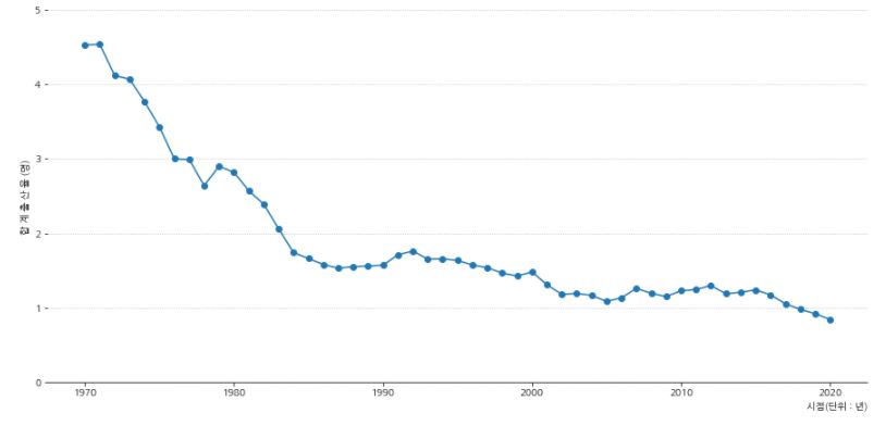
1.3.3. 합계출산율
합계출산율 : 한 여성이 가임기간(15~49세)에 낳을 것으로 기대되는 평균 출생아 수
- 합계출산율은 출산력 수준을 나타내는 대표적인 지표로 사용되고 있습니다.
- 바로 시작화를 해서 살펴봅니다.
1 2 3 4 5 6 7 8 9 10 11 12 13 14 15 16 17 18 19 20 21 | fig, ax = plt.subplots(figsize=(15,7)) # 축 제거 ax.spines['left'].set_visible(False) ax.spines['right'].set_visible(False) ax.spines['top'].set_visible(False) # 합계출산율 그래프 ax.plot(population_census['시점'], population_census['합계출산율(명)'], 'o-') # y축 범위 조정 ax.set_ylim(0,5) # grid 추가 ax.grid(axis='y', linestyle=':') # x, y축 label 설정 ax.set_xlabel('시점(단위 : 년)',loc='right') ax.set_ylabel('합 계 출 산 율 (명)') plt.show() |
-
1970년 산아제한정책 이후 1980년대 중반까지 급격하게 합계출산율이 1명대 까지 줄어드는 것을 볼 수 있습니다.
-
가장 최근 2020년 데이터 기준으로 합계출산율은 역대 최저치로 0.84명인 1명이 채 되지 않습니다.
-
여기까지 확인해보면 출산율은 혼인의 영향도 받지만 정책의 영향을 많이 받는 다고 생각할 수 있을 것 같습니다.
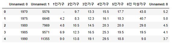
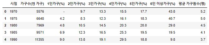
1.3.4. 가구원 수
- 흥미로운 데이터가 있어서 가져와 봤습니다.
- 데이터의 주기가 중간에 변하면서 정확한 수치는 알 수 없지만 추세를 알아 볼 수 있을 것 같습니다.
- 총 가구수의 변화를 그래프로 확인해 보겠습니다.
1 2 3 4 5 6 7 8 9 10 11 12 13 14 15 16 17 18 19 | fig, ax = plt.subplots(figsize=(15,7)) # 축 제거 ax.spines['left'].set_visible(False) ax.spines['right'].set_visible(False) ax.spines['top'].set_visible(False) ax.plot(df3['시점'], df3['가구수(천 가구)']) ax.set_ylim(0, 25000) # y축 범위 지정 # x, y축 label 설정 ax.set_ylabel('가구 수') ax.set_xlabel('시점(단위 : 년)',loc='right') # grid 설정 ax.grid(axis='y', linestyle=':') plt.show() |
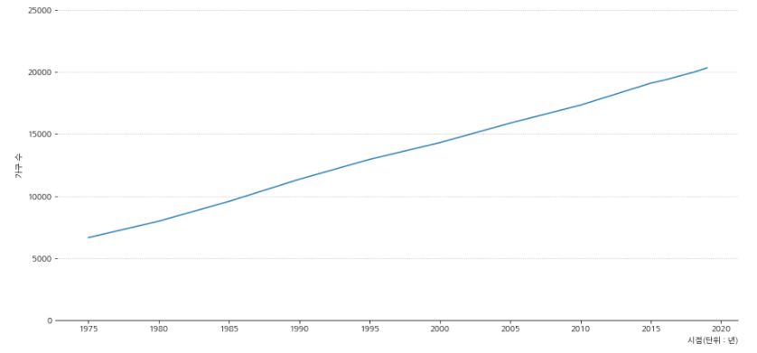
- 혼인 건수는 줄어들고 있지만 가구수는 일정하게 늘어나고 있는 것을 볼 수 있습니다.
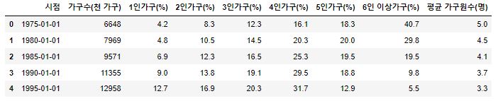
- 좀더 세분화 해서 가구 인원수 별 비중을 확인해 봅니다.
1 2 3 4 5 6 7 8 9 10 11 12 13 14 15 16 17 18 19 20 21 22 23 24 | fig, ax = plt.subplots(figsize=(15,7)) # 축 제거 ax.spines['left'].set_visible(False) ax.spines['right'].set_visible(False) ax.spines['top'].set_visible(False) df3[['시점', '1인가구(%)', '2인가구(%)']].plot(x='시점', ax=ax, linewidth=3) df3[['시점', '3인가구(%)', '4인가구(%)']].plot(x='시점', ax=ax, linewidth=0.8) df3[['시점','5인가구(%)', '6인 이상가구(%)']].plot(x='시점' ,ax=ax, linestyle='--', linewidth=2) ax.set_ylim(0,45) # y축 범위 지정 # x, y축 label 설정 ax.set_ylabel('비 중 (%)') ax.set_xlabel('시점(단위 : 년)',loc='right') # grid 설정 ax.grid(axis='y', linestyle=':') # 범례 표시 ax.legend(ncol=2) plt.show() |
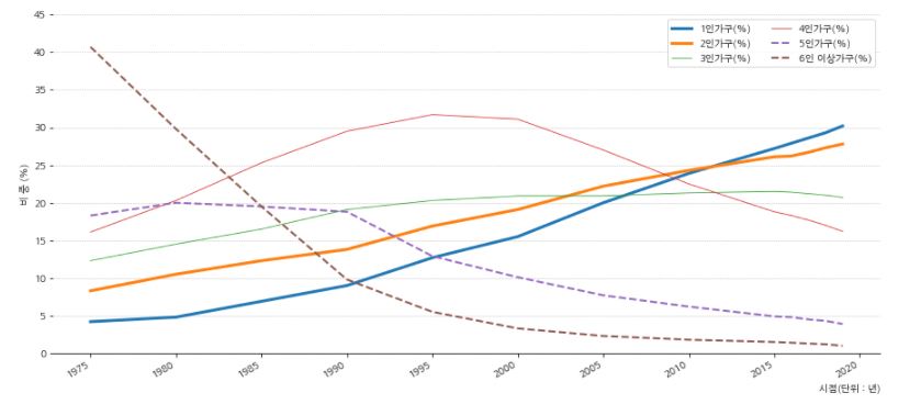
- 그래프를 확인해보면 5, 6인 이상의 가구는 급격히 줄어들고 있는것을 볼 수 있습니다.
- 4인가구 또한 2000년대를 기점으로 빠른속도로 줄어들고 있습니다.
- 1인, 2인 가구의 비중이 눈에 들어옵니다.
- 혼자 살거나 결혼은 하지만 자식은 낳지 않는 가구의 비중이 빠르게 증가하는 것을 볼 수 있습니다.
- 이러한 현상이 저출산으로 이어지고 있다고 판단할 수 있을 것 같습니다.
여기까지 인구 통계 데이터를 확인해봤습니다. 혼인 건수와 출산율은 지속적으로 줄고 있고 1인, 2인 가구의 비중이 점점 증가하고 있습니다. 또한, 사망자 수가 출생아 수를 넘어서면서 인구 감소가 진행되고 있습니다.
다음 포스팅에서는 경제적인 지표중 하나인 부동산의 데이터를 확인해보면서 비혼과 저출산 현상과 연관이 있을지 확인해 보겠습니다.
시각화는 Pega님 블로그 를 참고해 공부했습니다.